


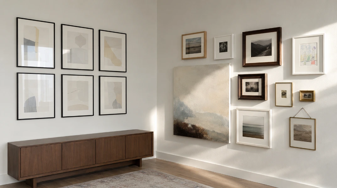
The tell is uniformity.
A matched set of six identical black frames, all the same size, all hung on a Sunday afternoon, all containing prints somebody bought at the same time from the same shop. It looks fine. It also looks exactly like what it is, which is a purchase rather than a collection.
The walls that work are the ones that took years to fill and show it.
What Makes a Gallery Wall Look Bought in One Go

Four things, and they nearly always travel together.
Every frame matches. Every piece is the same size. Every image is the same kind of image, usually abstract prints or typography. And every single one went up on the same day.
Break any one of those and the wall starts reading as personal. Break two or three and it stops looking arranged altogether.
The measurements below still matter, because a wall that ignores them looks careless rather than relaxed. There is a real difference between a collection that grew and a collection that was never thought about.
Hang the Centre of the Arrangement at 145cm

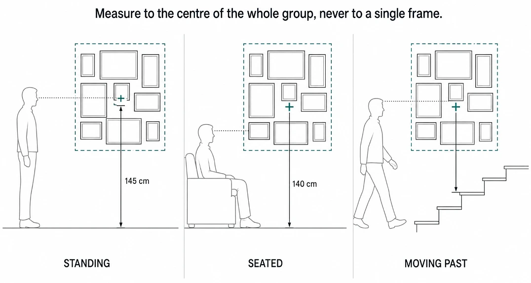
The gallery standard across the UK is 145cm from the floor to the centre of the display, which is roughly average adult eye level. Some framers extend that to 152cm depending on the room.
The word doing the work there is arrangement. You measure to the centre of the whole group, not to the centre of each individual frame. Treat the collection as one shape on the wall and everything else falls into place around it.
Two adjustments worth making.
In a living room or dining room, where people are mostly sitting down, drop it to around 140cm so it sits at seated eye level. In a hallway or up a staircase, hang a touch lower than instinct suggests, since people are moving past and standing closer to the wall than they would in a room.
Very high ceilings need their own maths. Divide the ceiling height by 1.75 and use that as your centre point.
Leave 5 to 8cm Between Frames
That gap is the convention, and it is worth respecting because it does something specific. Tighter spacing makes a group read as one collection. Wider spacing makes each piece feel independent.
Where I would push back on the standard advice is the obsession with making every gap identical. That works beautifully when the frames match, and it is close to impossible when they do not. If your pieces vary in size and depth and finish, chasing an exact 6cm on every side is how you end up with something that looks machine placed.
What matters more is the outer edge. Keep the outline of the whole arrangement roughly balanced and the eye forgives a lot of variation inside it.
Start With One Large Piece and Build Outwards
Pick the anchor first. Hang it. Then work outwards from it, using a spirit level on every single frame, because a tilt of two degrees will undo the whole thing.
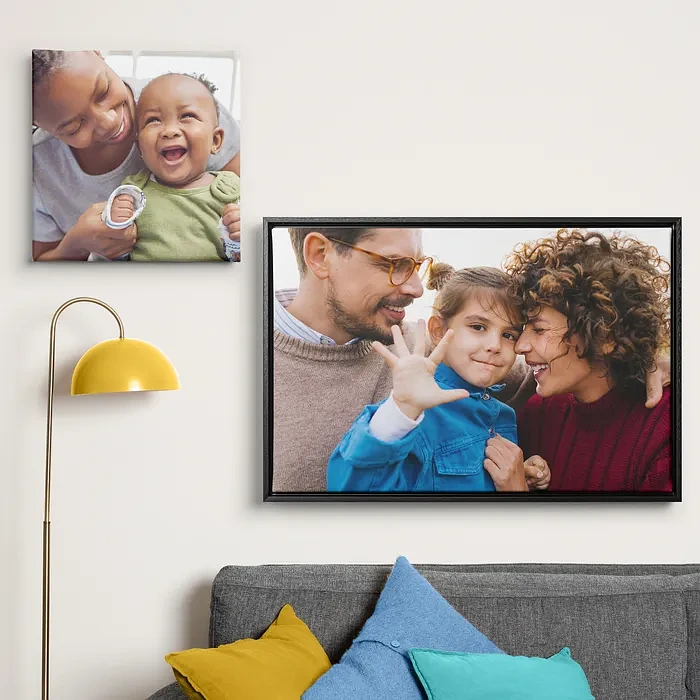
That anchor wants real scale. A personalised canvas works well in the position, partly because canvas sizes run large enough to hold a wall on their own, and partly because it carries no glass. In a mixed group, having one piece that does not bounce light back at the room gives the arrangement some depth, and the matte surface next to framed glass is a texture difference people notice without being able to name.
It is also the piece that makes the wall yours rather than anyone’s. A photograph you took, printed at 70x100cm, is not something a stranger could have bought.
Above a Sofa, Measure From the Furniture Instead

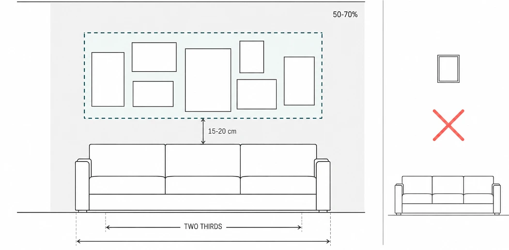
Forget the floor here. The relationship that matters is between the art and the thing underneath it.
- Leave 15 to 20cm between the top of the sofa and the bottom of the lowest frame.
- The arrangement should span roughly two thirds of the furniture width.
- Aim to cover somewhere between 50 and 70 percent of the available wall space.
Too much of a gap and the art floats. Too little and it looks like it slid down.
Cut Paper Templates Before You Touch a Drill
Trace each frame onto newspaper or wrapping paper, cut them out, and tape them up with masking tape.
Live with it for a day. Move things. This is the step everyone skips and it is the difference between four holes and fourteen.
Finding the exact nail position
Measure from the top of the frame down to the taut hanging wire or the D-ring. Subtract that figure from where the top of the frame needs to sit.
For a frame using wire, use two hooks rather than one. A single hook lets the frame drift out of level over the following months, which is why so many gallery walls look slightly drunk a year later.
Which Fixing for Which Wall
Getting this wrong is how pictures end up on the floor.
- Plasterboard, use a dedicated hollow wall anchor, not a nail.
- Brick or solid masonry, a standard wall plug and screw.
- Light frames under roughly 3kg, adhesive hook and loop strips are fine, which matters if you are renting.
- Anything heavy on a stud wall, fix into the timber stud rather than trusting the board.
- Period homes with a picture rail, use it. Moulding hooks and cord mean no holes at all, and it is what the rail was installed for.
Let It Grow, and Let It Be Uneven

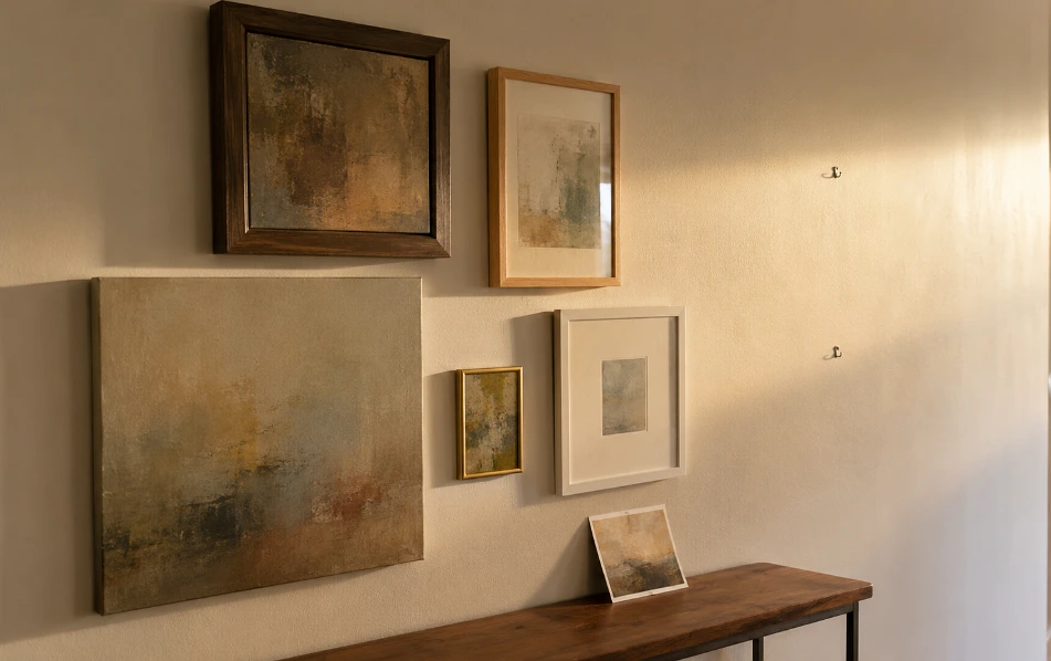
Here is the part that actually answers the title, and it has nothing to do with measurements. A wall stops looking like a showroom the moment it contains things that could not be bought together, and the only reliable way to get there is to stop trying to finish it in one afternoon. Hang the anchor and three or four pieces you already love, then leave gaps you have no plan for. Over the next year something will turn up. A photograph from a trip, a print from a market stall, your daughter’s drawing of the dog, a ticket stub in a small frame, a postcard somebody sent that was too good to bin. Each of those goes up as it arrives, and each one is slightly wrong next to what is already there, and that wrongness is precisely what makes the wall read as a record of a life rather than a shopping decision. The frames will not match. The finishes will not match. One piece will be a bit too small for its position and you will keep it there anyway because of what it is. I would take that over a perfectly executed grid of six matching prints every time, and so, I suspect, would anyone who has ever stood in front of both.
The measurements keep it from looking sloppy. The contents keep it from looking bought.