

Blog
5 Design Choices That Make a Room Look Expensive

The majority of people who make this mistake don’t purchase inexpensive goods. They are purchasing fairly priced items and then quietly undercutting everything with four or five decisions. The furniture is in good condition. The colours are effective. Clearly, nothing is broken. It simply doesn’t appear correct. The rooms that appear good, such as those you take pictures of in hotels or take screenshots from interior accounts, don’t always cost more. They simply got a few specific things perfect at the same time, and it’s the combination that makes the difference.
The fabric on your bed or sofa
The bed or the sofa is the biggest soft surface in every room, and the hand and eye go there every day. The majority of people utterly overlook this and spend hours obsessing over wall colour.
Usually, the shade isn’t the giveaway. The weaving is the cause. Blends of polyester and cotton, as well as anything with a faint plasticky shine, appear cheap even from a distance. The brain catches up after the eye detects it. Sateen cotton has a delicate sheen that reflects light without being glossy. Percale has the matte, somewhat crisp texture found in good hotels. Houses like Yves Delorme weave luxury bedding across the full range — percale, sateen, jacquard, batiste — using long-staple cottons, and the difference between that and a printed polycotton from a high-street pack is something the eye picks up before the brain catches up to it.
By the way, thread count is mainly meaningless. A 300 thread count Egyptian cotton percale from a reputable manufacturer will feel better than a 1,200 thread count sheet from a bargain store since thread count is manipulated by counting threads in multi-ply yarns. It will feel as though the bedding is quite inexpensive.
For couches, wool, velvet, and linen combine with age to create a compound over time. From year one, synthetic microfibres with a faint gloss seem inexpensive, and by year three, they start to look much worse. This is the most important decision if you plan to retain a sofa for ten years.
Light from three different heights
The same room feels completely different at night under lamplight than under a ceiling fixture during the day. Not because of how much light there is — because of the angle.
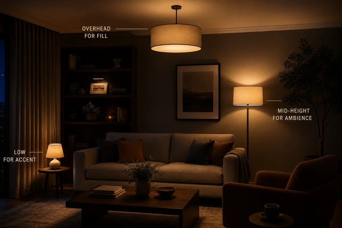
A room with one overhead source, however nice the pendant, feels functional. Office. Dentist’s waiting room. The shift happens when light comes from at least three different heights: overhead for fill, a mid-height source like a wall sconce or tall floor lamp, and something low — a table lamp, a picture light. Each casts shadows differently. Together they create depth, which is exactly what photographers do when shooting rooms for magazines and what most homeowners never bother with.
Bulb temperature is the quick win here. Warm white at around 2,700K is what good hotels use because it’s flattering to skin and fabric. Anything above 4,000K — labelled “daylight” or “cool white” — makes a room feel like a supermarket. Check every bulb in your house. Swap the cold ones. The room looks more expensive within an hour and it costs almost nothing.
A plug-in dimmer adapter costs about fifteen pounds and works on most lamps, though you need to check the bulbs are rated as dimmable first because a non-dimmable LED on a dimmer circuit just flickers and annoys you.
Paint finish over paint colour
Contrary to popular belief, colour has very little significance. The true distinction lies in the finish.
Flat matte emulsion gives walls real depth by absorbing light. Limewash has been used for generations and has a mottled, uneven appearance that gives a surface an almost three-dimensional appearance. Because high-gloss lacquer reflects light like polished stone, it appears intentional and costly in a study or powder room. Because it lacks the drama of gloss and the depth of matte, the medium level, which includes satin and silk, tends to look the cheapest of all.
Pale colours are harmed by British light. They read as rented and wash out. Going lighter than you should is usually instinctive. Before committing, test any paint in the morning, afternoon, and at night. The majority of colours appear completely different beneath each other. Usually, the more costly option is two or three colours warmer and darker than what you initially thought.
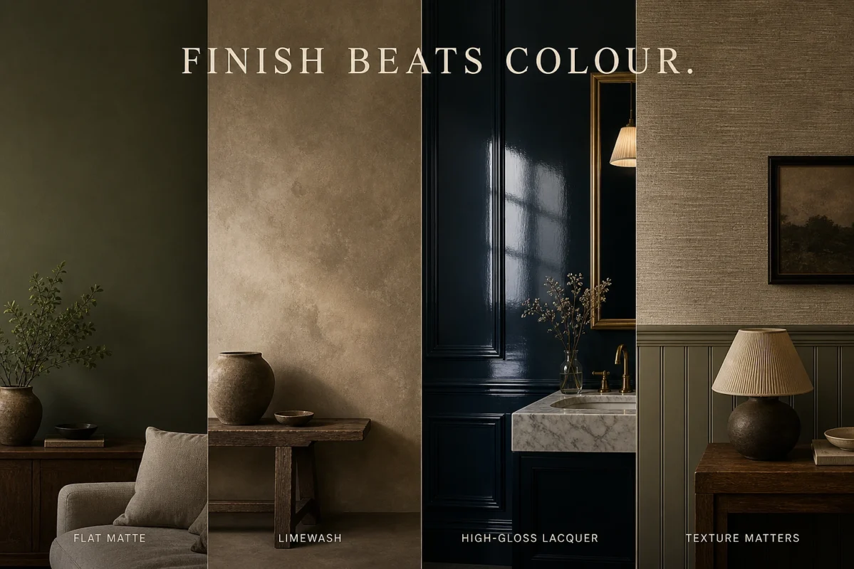
Surface texture does something paint simply can’t. Beadboard adds visible craft. A proper skim-coat with slight imperfections has more character than perfectly flat plasterboard. Grasscloth or a textured wallpaper adds something that printed vinyl never achieves regardless of the pattern on it.
Curtain length and where the rod goes
This one is everywhere in British homes and it drives interior designers round the bend. Curtains that finish several inches above the floor, hanging like trousers cut too short.
The rod goes above the window frame — six to twelve inches above for a room with reasonable ceiling height. This makes the window look bigger and pulls the eye upward, which makes the whole room feel taller than it is. The curtain itself should either kiss the floor exactly or pool slightly on it. More than half an inch of gap looks like a mistake regardless of whether it was intentional.
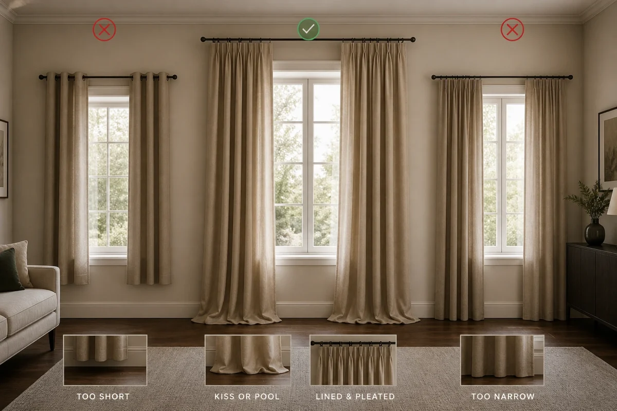
Width matters too. At minimum twice the window width, ideally two and a half times. Curtains that barely meet when drawn look underfunded whatever the fabric cost. Lined curtains hang better than unlined ones — the lining adds weight, and the extra weight is what creates the proper drape. Pinch or pencil pleating rather than eyelet in a thin synthetic, always.
Remove things rather than add them
Crowded rooms look cheap. Not because of any individual object in them but because of the density. Every surface occupied, every wall covered in three small frames instead of one larger piece, every corner with a plant plus a basket plus something else that crept in.
The rooms that look expensive breathe. One substantial piece on the main wall. One vase on the mantelpiece rather than a cluster of small ornaments. A coffee table with two or three considered objects, not ten. The empty space around each thing is what lets the eye settle, and settled is what expensive actually feels like.
Clear everything off your surfaces and put back only what genuinely earns its place. Most rooms improve immediately once 40% of the small objects leave. Scaling up — buying one large thing instead of several small ones — usually costs less too, because small decorative objects carry very high margins in shops.
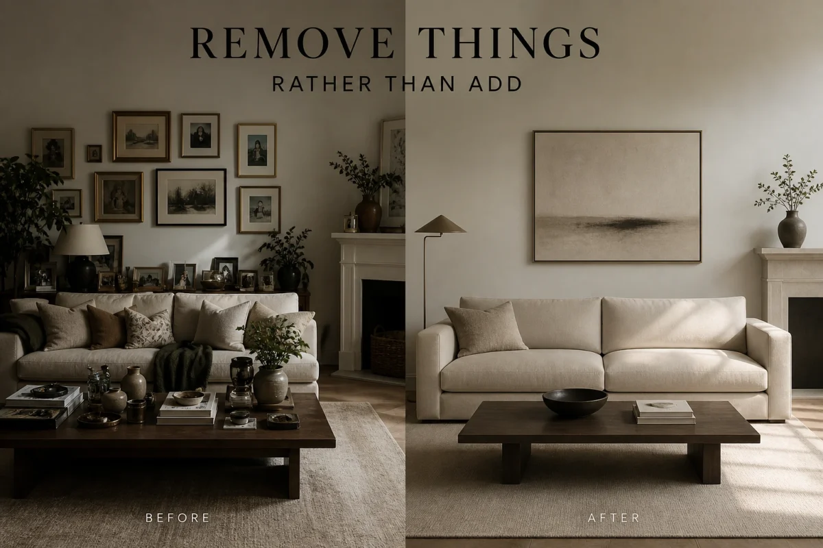
Furniture follows the same principle. One generous sofa reads better than a sofa plus two armchairs plus an ottoman crowded into the same space. Restraint is the cheapest upgrade available, and almost nobody uses it because removing things feels like going backwards even when it clearly isn’t.