
Blog
Orange Wall Art Works in Rooms Where Orange Paint Never Could
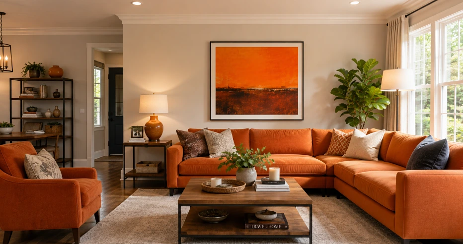
Ask a room full of designers whether they like orange and the answer splits by format, on walls they hesitate, in a frame they almost all say yes. That split is worth understanding before you spend anything, because it explains both why the colour is having a moment and why so many homes still refuse it.
Who Likes Orange, and Where
Across the clay-building parts of the world, orange was never a choice, it’s just what home looks like. Morocco, Mexico, southern Spain, Rajasthan, terracotta is the default backdrop there because baked earth is orange, and in India saffron and marigold carry meaning that goes far past decoration, so a saturated orange room raises no eyebrows at all. The hesitant countries are the pale ones, Scandinavia, Japan, Britain, places whose interiors run white, grey and beige and whose homeowners treat strong colour as a commitment with consequences.
The trend data says even the hesitant places are warming up. Pinterest flagged persimmon as a breakout shade off real search behaviour, and designer surveys keep showing maximalism overtaking minimalism, rooms drifting warmer and more personal.
Why the Colour Stays Unpopular in Certain Homes
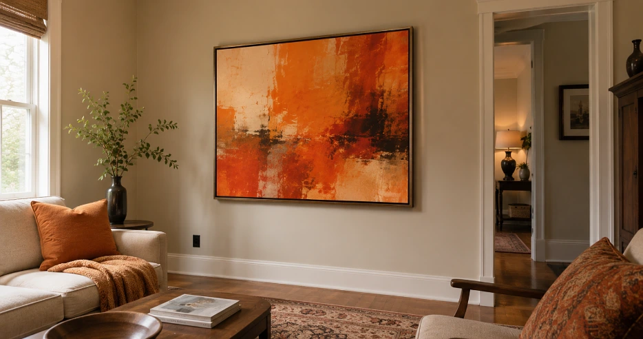
The resistance is practical before it’s aesthetic, and it clusters in predictable house types. Rented flats stay neutral because landlords repaint in magnolia and tenants can’t commit anyway. Houses heading for sale stay neutral because every estate agent on earth preaches that beige sells. Small north-facing rooms resist saturated orange for a physics reason, cool grey light turns it muddy and heavy.
And in Britain there’s a memory layered on top, the orange-and-brown 1970s living room a whole generation swore never to repeat. Terracotta escapes that flinch only because it arrives via Mediterranean holidays rather than via 1974.
A Frame Gets Orange Into All of Those Homes
Two things change when the colour hangs instead of covers. It becomes reversible, which dissolves the rental, resale and commitment objections in one go, and it behaves better in bad light, because a canvas is one contained field of pigment with white wall breathing around it, where a full painted wall in a dim room just closes in.
That’s why the sensible test costs a picture hook, not a repaint. If you’re weighing the colour up, start with orange paintings rather than a tin, hang one piece where you’ll see it daily, live with it through a season of changing light, then decide whether the colour has earned a wall. Most people discover the frame was the right amount all along.
The Rooms Where Orange Art Earns Its Spot
Gathering rooms first, winding-down rooms last, and the research agrees with the folk wisdom here, a 2025 systematic review covering 128 years of psychological research found warm shades consistently read as energising and social while cool ones read as calming. Room by room:
- Living rooms take the largest piece, one bold canvas above a neutral sofa does the anchoring work a feature wall used to do.
- Kitchens and dining spaces suit the burnt end of the family, warm tones sit naturally beside wood, food and morning light.
- Hallways are the free win, nobody lingers there, so a strong piece adds life with zero risk of fatigue.
- Bedrooms and reading corners want apricot and soft terracotta only, saturated orange in a sleep space tips into overstimulating fast.
Styles and Pairings That Hold the Colour
Some interiors were practically built waiting for orange art. Mid-century rooms with teak already share its palette, period homes with warm brick and dark wood absorb it comfortably, and grey-heavy new builds are the surprise winner, one warm canvas fixes the clinical feel those interiors are always accused of. The strictest minimalist and japandi schemes take only the palest apricot end, anything louder breaks the scheme’s own rules.
| Pair it with | Why it works |
| Oak, walnut, rattan | Wood shares orange’s undertone, so nothing fights |
| Linen, wool, stone | Matte neutral textures let the colour do the talking |
| Deep blue and indigo | The classic complement, makes both sides look deliberate |
| Sage and olive green | Earthy pairing that calms the orange down |
| Brass and aged metals | Warm metallics extend the glow instead of competing |
Using It Without Overwhelming the Room
One focal piece beats five scattered orange objects every time, a single strong canvas reads as a decision while a sprinkle of orange cushions, prints and vases reads as an accident that kept happening, and the old 60-30-10 habit still serves here, neutrals doing most of the room, a secondary tone supporting, orange arriving only in that final ten percent where accents live. Scale matters as much as quantity, a small print on a big empty wall looks apologetic, so size the piece to the wall and let it be the one loud thing. If you’re moving into a new home, run this sequence deliberately, art and objects first, paint verdicts after you’ve watched the light move through the rooms for a few months. The frame will tell you which walls, if any, deserve the colour permanently, and in plenty of homes the honest answer stays what it was on day one, the painting was enough.